Enter Password

Project overview

Project overview

About the Project

One app for enrolled devices giving IT admins and users a single place to check device specs, install approved apps, confirm location check-ins, and stay connected with messages from their team. All secure, all simple.

One app for enrolled devices giving IT admins and users a single place to check device specs, install approved apps, confirm location check-ins, and stay connected with messages from their team. All secure, all simple.

MY Role

MY Role

I was the only product designer on this project. From day one, I worked shoulder to shoulder with our PM, developers, and illustrator from digging into research through to final handoff. My job was to simplify without stripping out the power features enterprise admins rely on.

I was the only product designer on this project. From day one, I worked shoulder to shoulder with our PM, developers, and illustrator from digging into research through to final handoff. My job was to simplify without stripping out the power features enterprise admins rely on.

Project timeline

Project timeline

4 Months

Platforms

Platforms

iOS, Android, Android TV

Business Goal

Business Goal

1

Make the app usable for admins of all skill levels.

2

Build a clean, scalable design system.

3

Help users complete key tasks faster.

4

Prepare the product to scale for larger enterprise rollouts.

Problem Statement

Problem Statement

Even though the app could do a lot, adoption rates were low and onboarding drop offs were high. Admins and users were getting lost in inconsistent flows, and the dated UI made the product feel harder than it really was.

Even though the app could do a lot, adoption rates were low and onboarding drop offs were high. Admins and users were getting lost in inconsistent flows, and the dated UI made the product feel harder than it really was.

Onboarding looked and felt different on every platform

Simple actions, like syncing a device, weren’t in the user’s control.

The interface was old enough to make a bad first impression.

No dark mode a big ask from enterprise clients.

(Platform App Lineup)

(Platform App Lineup)

Discovery & Research Insights

Discovery & Research Insights

Methods Used

Methods Used

To understand the problems better, We used.

To understand the problems better, We used.

Stakeholder interviews to clarify business priorities.

UX audits of the current app

Competitive analysis of four other UEM products.

What We Learned

What We Learned

We gathered insights through feedback and data. Here’s what stood out.

We gathered insights through feedback and data. Here’s what stood out.

Inconsistent onboarding flows created confusion and extra training work for IT teams.

Inconsistent onboarding flows created confusion and extra training work for IT teams.

Lack of control over tasks like device sync made admins feel dependent on support.

The outdated interface lowered trust and perceived value.

Dark mode was a repeated request for both comfort and compliance.

Dark mode was a repeated request for both comfort and compliance.

Strategy & Process

Strategy & Process

Design Strategy

Design Strategy

Platform Familiarity

Platform Familiarity

Kept native iOS and Android patterns to reduce learning time.

Simplified Onboarding

Simplified Onboarding

Broke down setup into guided, visual steps with progress indicators.

Accessibility & Comfort

Accessibility & Comfort

Introduced light/dark themes, meeting WCAG AA contrast standards.

Design Process

Design Process

Define

Define

Mapped out critical user flows onboarding, app catalog, device sync, and remote actions.

Design & Prototype

Design & Prototype

Built high fidelity prototypes in Figma for each platform, testing interactions as early as possible.

Validate

Validate

Tested with IT admins in moderated sessions, refining navigation and copy based on feedback.

Solutions

Solutions

Streamlined Onboarding

Streamlined Onboarding

  • Simplified language and steps


  • Used illustrations, plain language, and a clear progress bar.

  • Simplified language and steps


  • Used illustrations, plain language, and a clear progress bar.

Impact: 40% fewer onboarding drop offs.

Homepage as Command Center

Homepage as Command Center

  • Surface critical device info up front.


  • Show “Last Sync” and quick-action buttons for common tasks.

  • Surface critical device info up front.


  • Show “Last Sync” and quick-action buttons for common tasks.

Impact: Key info is now found in under 4 seconds.

Swipe Down to Sync

Swipe Down to Sync

  • Added swipe down to trigger sync


  • Gave users control over sync timing without relying on auto sync


  • Provided instant sync feedback

  • Added swipe down to trigger sync


  • Gave users control over sync timing without relying on auto sync


  • Provided instant sync feedback

Impact: Gave admins and users more autonomy and reduced sync related support calls.

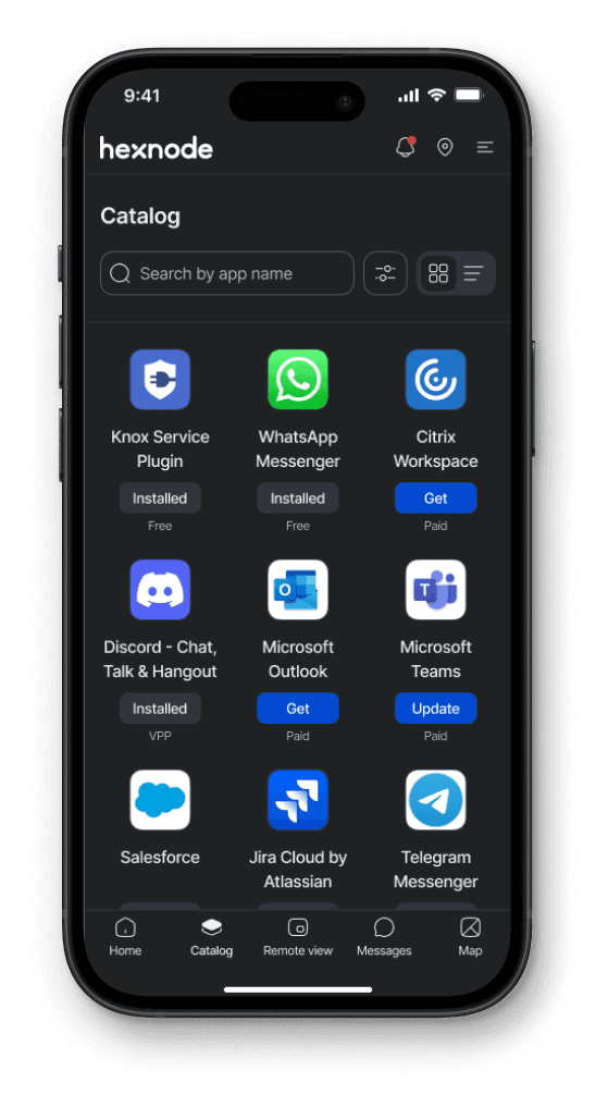
Centralized App Catalog

Centralized App Catalog

  • Centralized app install page


  • Displayed all admin approved apps


  • Allowed direct installs without support

  • Centralized app install page


  • Displayed all admin approved apps


  • Allowed direct installs without support

Impact: Support tickets for app installs dropped by 22%.

Remote View

Remote View

  • One tap remote access for admins


  • Micro animations for smoother flow

  • One tap remote access for admins


  • Micro animations for smoother flow

Impact: Remote command success rate jumped from 68% to 91%.

Error Handling

Error Handling

  • Guided errors with micro animations


  • Clear, actionable error messages


  • Maintained a friendly UI during failures

  • Guided errors with micro animations


  • Clear, actionable error messages


  • Maintained a friendly UI during failures

Remote Ring

Remote Ring

  • Locate silent/misplaced devices easily


  • Micro animation confirms ring trigger

  • Locate silent/misplaced devices easily


  • Micro animation confirms ring trigger

Lost Mode

Lost Mode

  • Remotely lock and track the device


  • Display a custom message for recovery


  • Hidden tap area lets user safely exit Lost Mode once found

  • Remotely lock and track the device


  • Display a custom message for recovery


  • Hidden tap area lets user safely exit Lost Mode once found

Android TV

Android TV

Optimized the design for Android TV, ensuring seamless usability and visual harmony across devices.

Optimized the design for Android TV, ensuring seamless usability and visual harmony across devices.

Dark Mode & Theming

Dark Mode & Theming

Implemented in alignment with accessibility standards (WCAG AA)

Impact: Boosted satisfaction scores by 15% among night-shift admins
(Swipe to explore →)

(Swipe to explore →)

Wrapping Up

Wrapping Up

Here’s a quick look at the final UI across different platforms. The redesigned experience brings consistency, clarity, and modern workflows to the unified UEM app.

(Swipe to explore →)

(Swipe to explore →)

Outcomes & Impact

Outcomes & Impact

Impact

Impact

40%

improvement through streamlined flows.

27%

improvement in task completion rates

Security

Better visibility into security compliance for IT teams

Satisfaction

Increased user satisfaction, especially for accessibility features

Reflection

Reflection

This project pushed me to think beyond individual screens into system level design consistency across platforms. I learned to simplify without oversimplifying preserving enterprise functionality while making it approachable

Let’s Create Something Amazing

Design is better when it’s shared. I’m all ears for collaborations, side quests, or full-on creative missions.

Build with ♥️

Let’s Create Something Amazing

Design is better when it’s shared. I’m all ears for collaborations, side quests, or full-on creative missions.

Build with ♥️

Let’s Create Something Amazing

Design is better when it’s shared. I’m all ears for collaborations, side quests, or full-on creative missions.

Build with ♥️

Create a free website with Framer, the website builder loved by startups, designers and agencies.