Enter Password

Project overview

Project overview

About the Project

The old UEM portal did its job, but it felt outdated and hard to use. People who relied on it every day found it slow and confusing. New users didn’t know where to start, and even experienced ones had to click around a lot to get things done. A past redesign had been dropped before it launched, so this time the plan was to improve it carefully make it modern and easy, without changing how people already worked.

The old UEM portal did its job, but it felt outdated and hard to use. People who relied on it every day found it slow and confusing. New users didn’t know where to start, and even experienced ones had to click around a lot to get things done. A past redesign had been dropped before it launched, so this time the plan was to improve it carefully make it modern and easy, without changing how people already worked.

MY Role

MY Role

I led the design efforts, working hand in hand with a junior product designer, our PM, and the engineering team to bring this vision to life.

I led the design efforts, working hand in hand with a junior product designer, our PM, and the engineering team to bring this vision to life.

Project timeline

Project timeline

~ 5 Months

Platforms

Platforms

web platform especially for desktop and tablet users

Business Ask

Business Ask

Their request was straightforward but tricky “Make it look modern and easier to use but don’t break the way people already work”

Discovery & Research Insights

Discovery & Research Insights

Methods Used

Methods Used

Before jumping into design, we gathered context by looking at how the portal was being used and what users were struggling with.

Before jumping into design, we gathered context by looking at how the portal was being used and what users were struggling with.

Held discussions with internal support and sales teams to surface recurring issues

Reviewed user activity data and heatmaps to identify drop-off points

Looked at archived redesign proposals to understand what didn’t work previously

Set up a design system to guide the revamp

Key Insights & Users problem

Key Insights & Users problem

From our research, a few clear patterns emerged that helped shape our direction

From our research, a few clear patterns emerged that helped shape our direction

First

the interface was overwhelming too much crammed onto the screen with no clear focus.

Second

Second

new users were lost. During onboarding, they weren’t sure where to begin or what features were relevant to them.

And finally

And finally

admins managing hundreds or even thousands of devices were spending far too much time filtering, deploying, and configuring.

Strategy & Process

Strategy & Process

Where We Started

Where We Started

We began by breaking down the legacy experience to understand what needed to stay, what needed to go, and what needed fixing.

We began by breaking down the legacy experience to understand what needed to stay, what needed to go, and what needed fixing.

Audited the product to spot key UX issues

Mapped user flows to find blockers

Identified essentials worth preserving

Set up a design system to guide the revamp
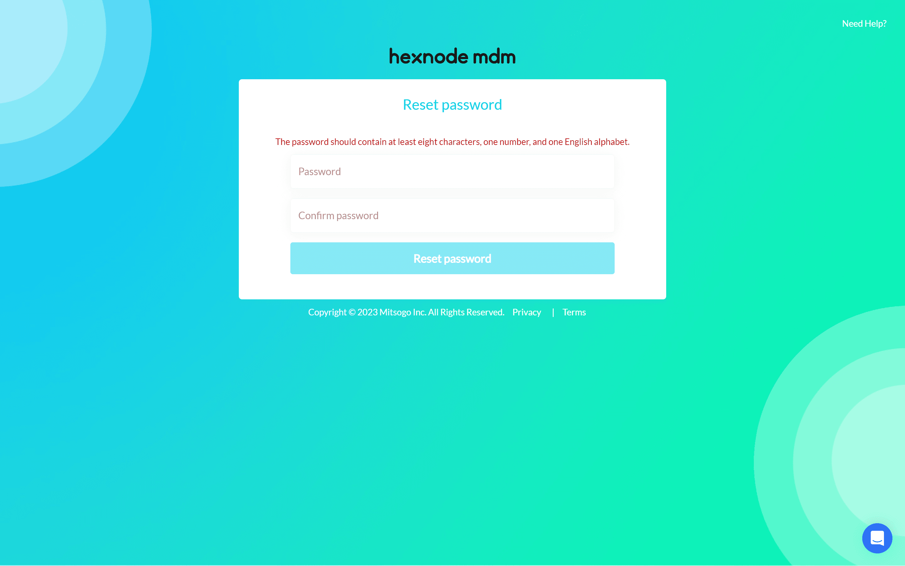
(legacy portal overview)

Our Challenge

Our Challenge

The challenge was to modernize the platform without forcing users to relearn it.

The challenge was to modernize the platform without forcing users to relearn it.

Keep workflows intact while improving usability

Refresh the UI without confusing users

Make it scalable for future features

Work within limits of time and tech

Design System

Design System

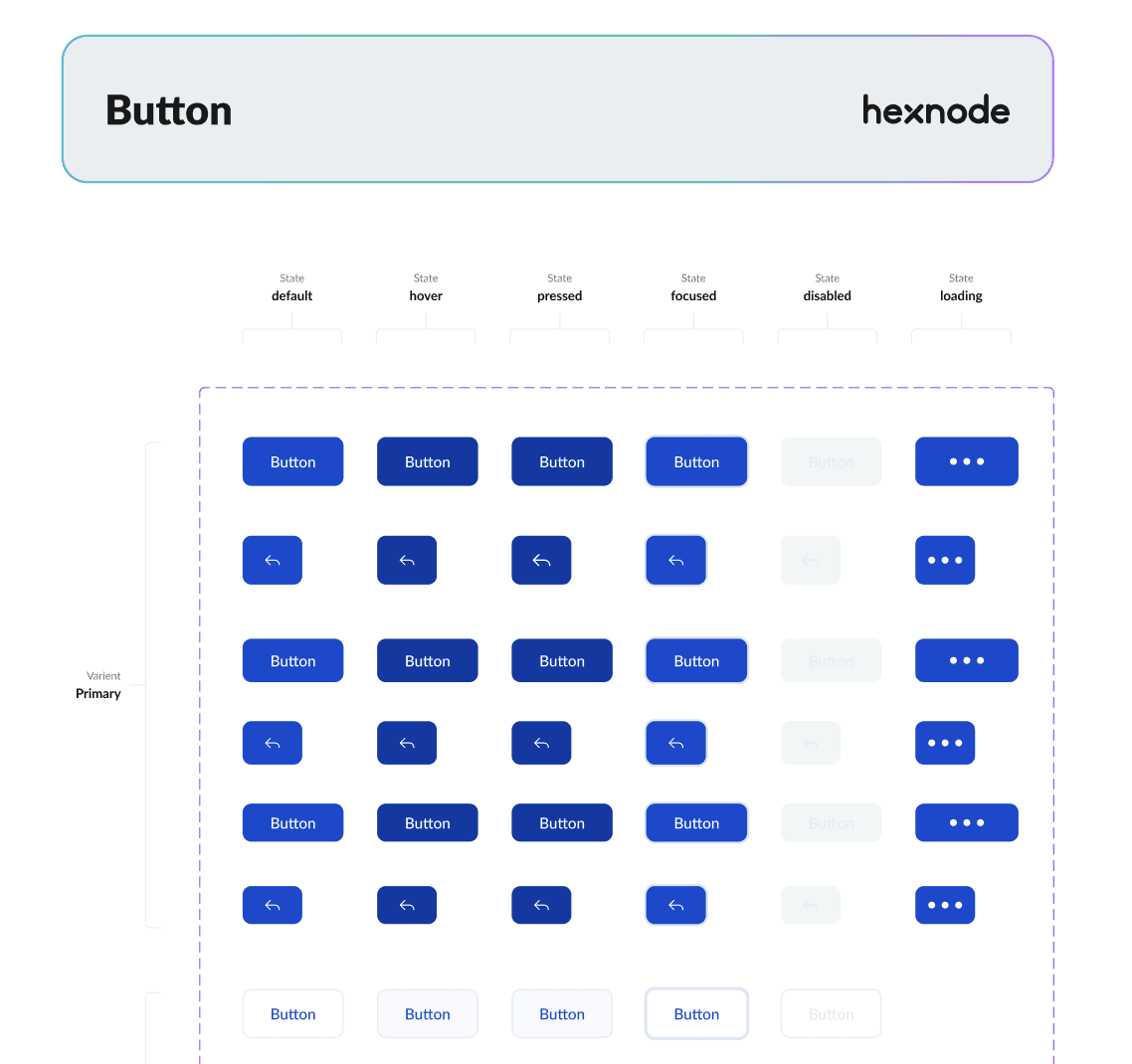
Building the Design System

Building the Design System

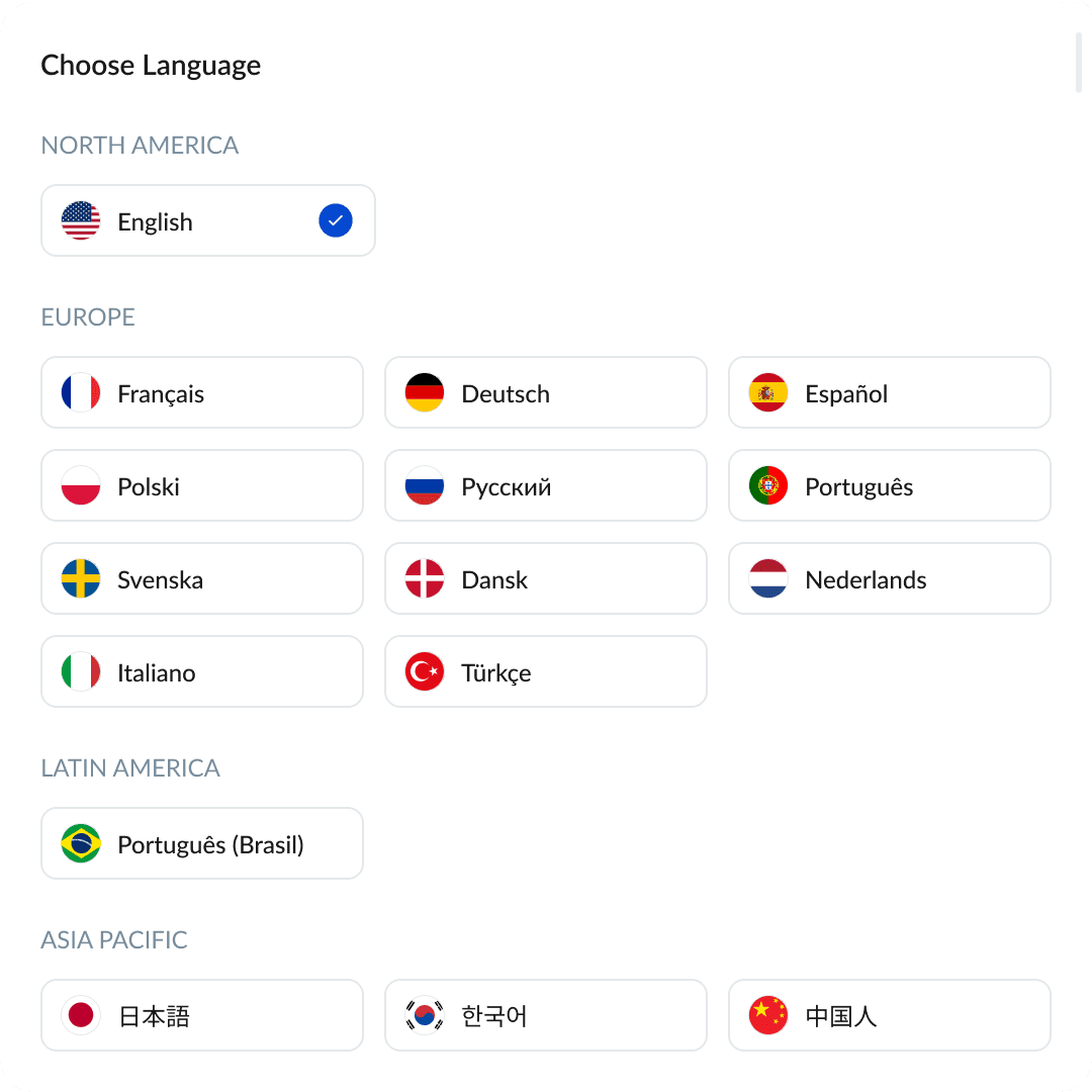
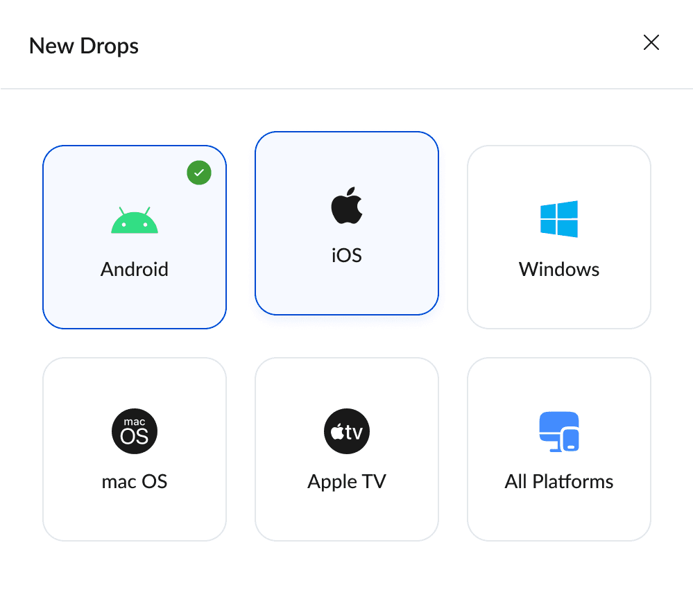
While working on the facelift, we built a modular and scalable design system to support long term evolution.

While working on the facelift, we built a modular and scalable design system to support long term evolution.

Why We Needed One

Why We Needed One

The legacy portal used inconsistent styles and duplicated UI patterns.

Each module looked and behaved differently, leading to usability and maintenance issues.

Developers were rebuilding the same components repeatedly with small variations.

Future scaling would be extremely difficult without a shared system of truth.

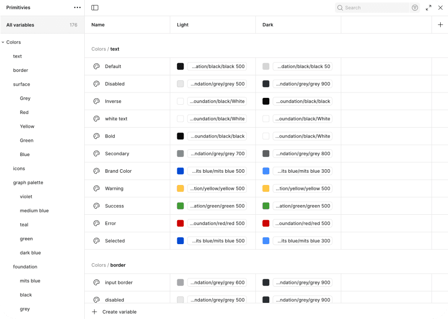
Foundations

Foundations

  • Color palette (system colors, semantic

    colors, states)


  • Typography scale (heading sizes, line
    heights, weights)
Reusable Components

Reusable Components

  • Buttons, modals, input fields, tooltips, tabs,
    tables, dropdowns


  • Status badges, chips, and alerts for quick
    device/data interpretation

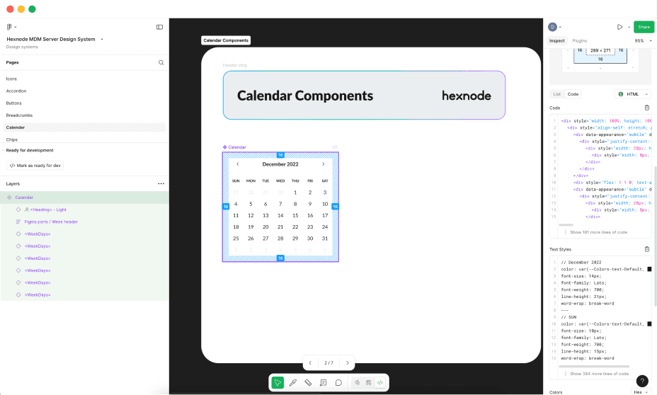
Design Dev Handoff Improvements

Design Dev Handoff Improvements

  • Used Auto Layout & Variants to mirror dev logic and reduce confusion


  • Worked closely with front-end team to build matching component library in code
What We Improved

What We Improved

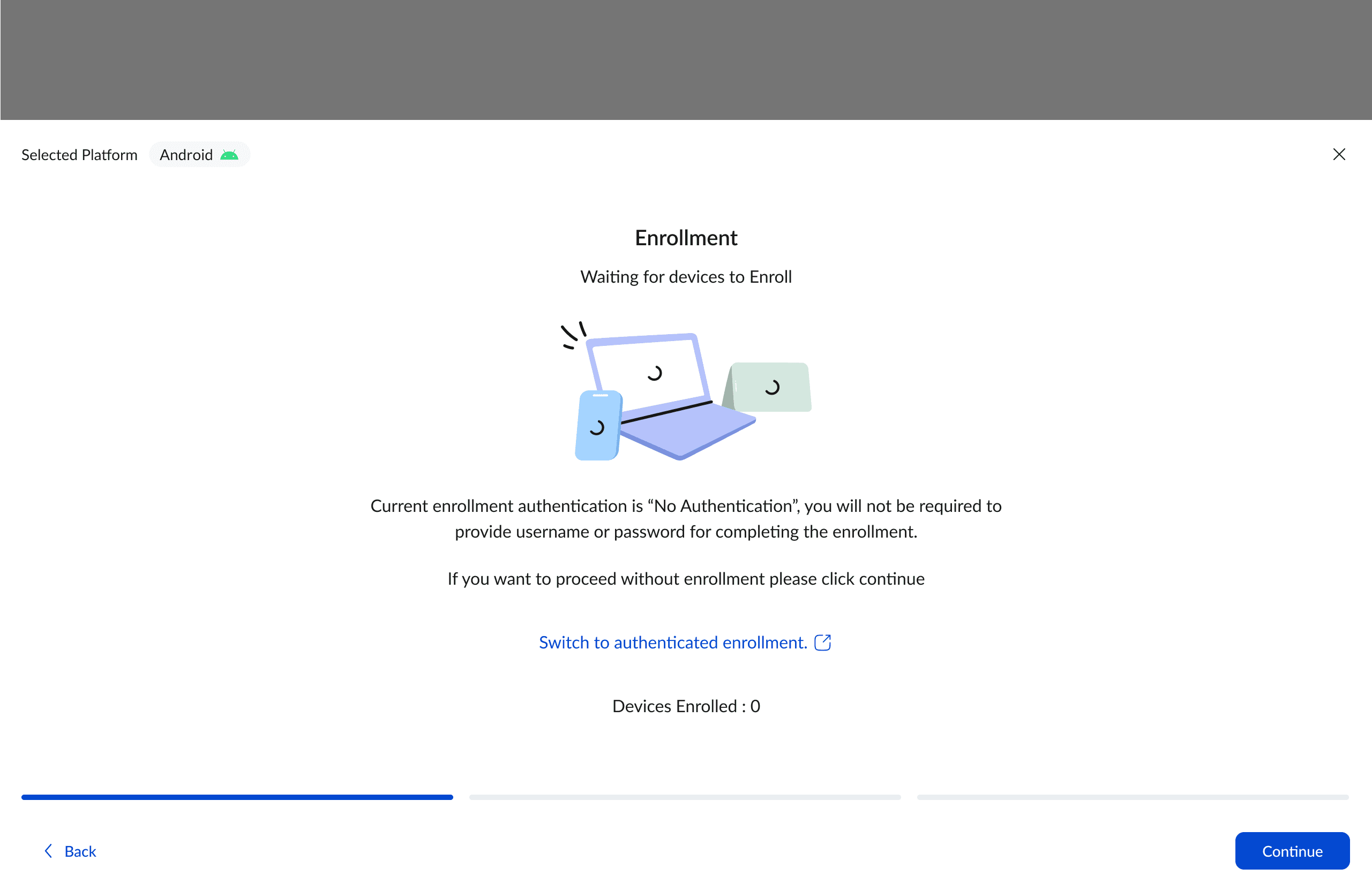
Login & Onboarding

Login & Onboarding

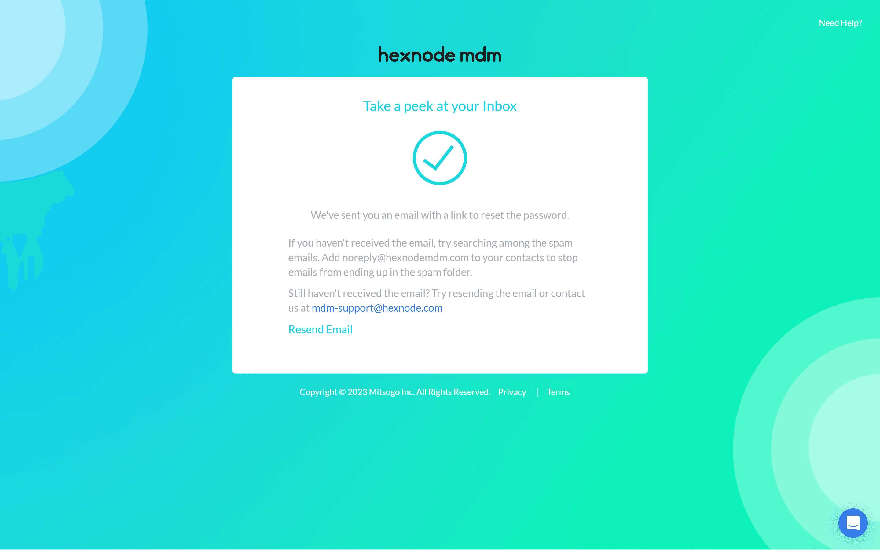
We stripped away the noise, focusing on clear screens, onboarding tips, and contextual help.

Impact: New users complete onboarding 35% faster and feel more confident exploring the portal.
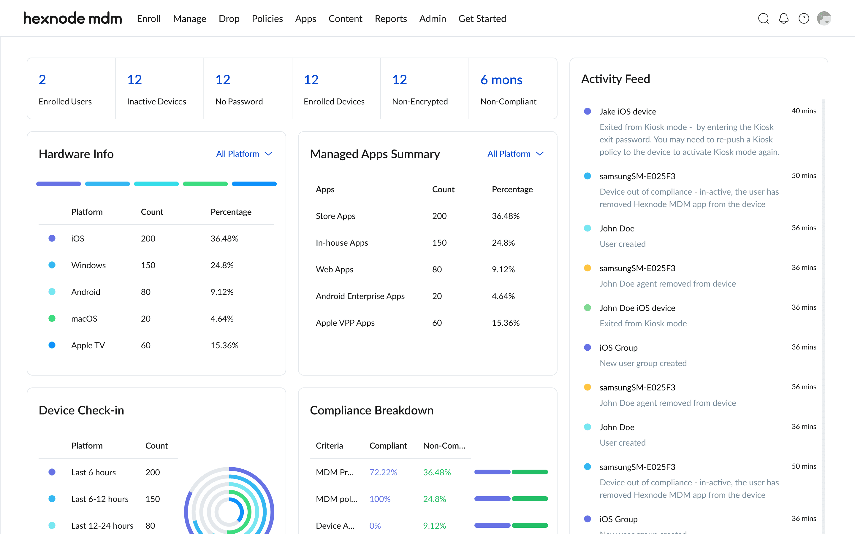
Dashboard

Dashboard

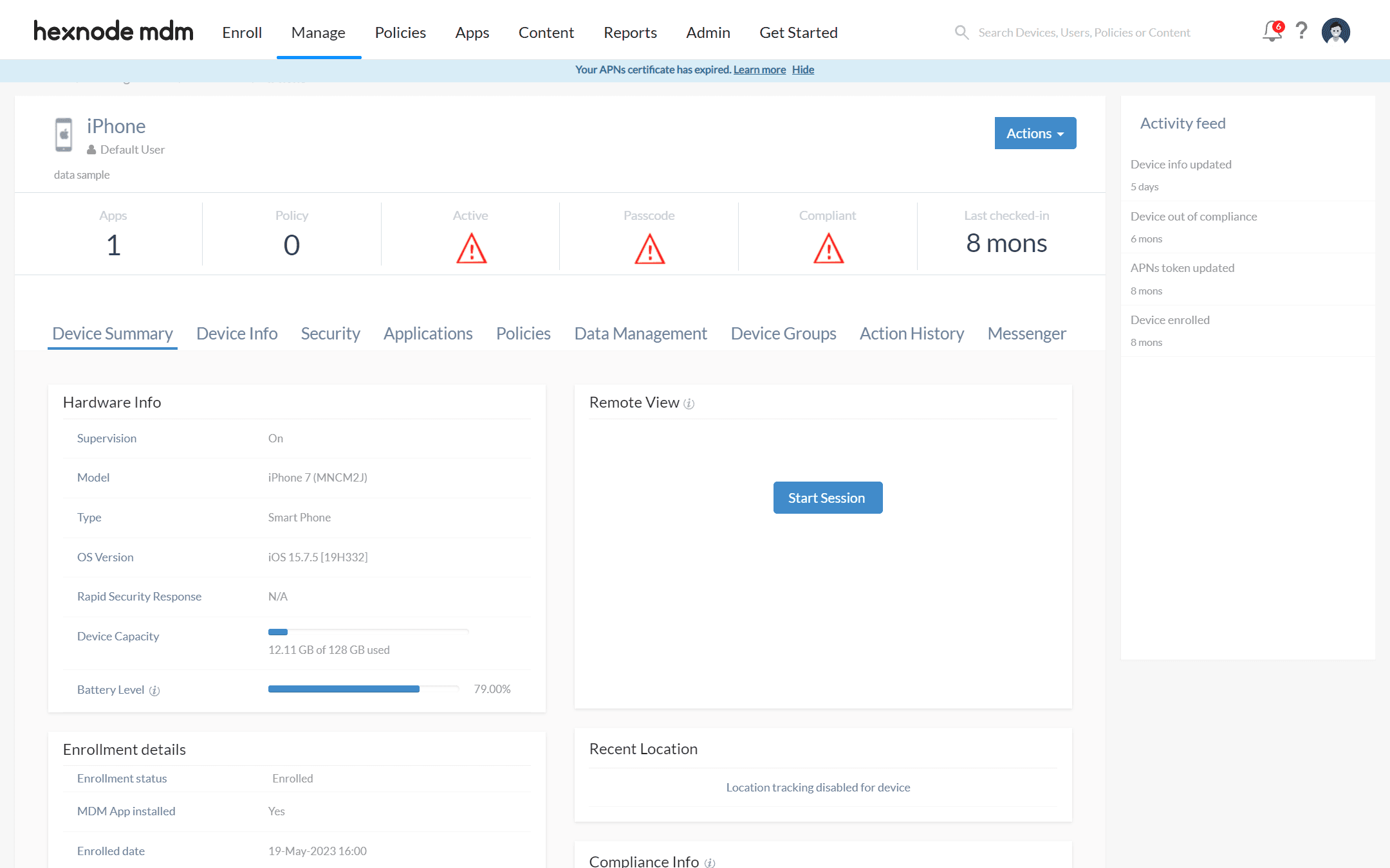
We kept the important data but reorganized it so users could scan and act faster.

Impact: Primary actions are found 40% faster, and complaints about clutter have dropped noticeably.
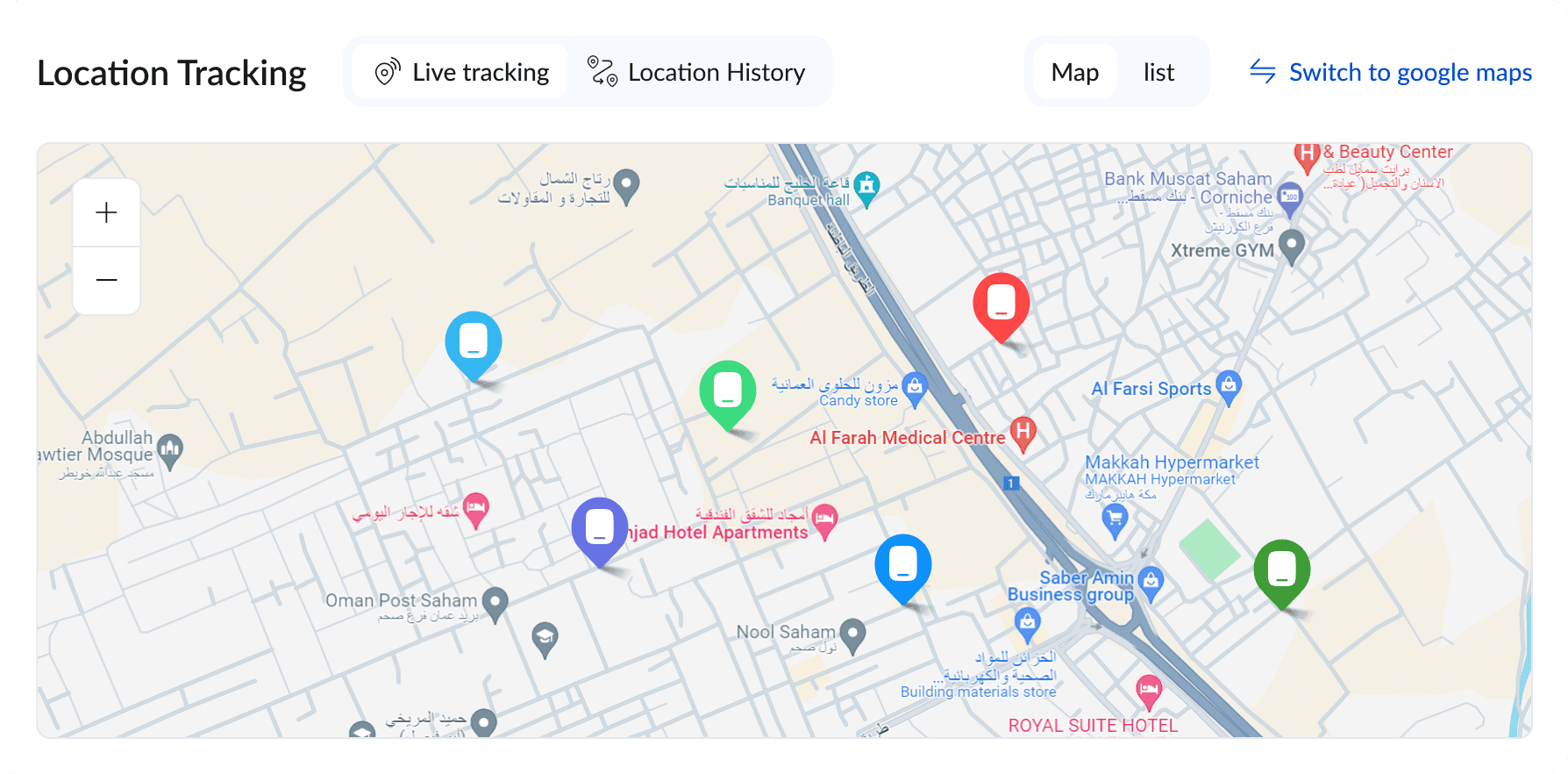
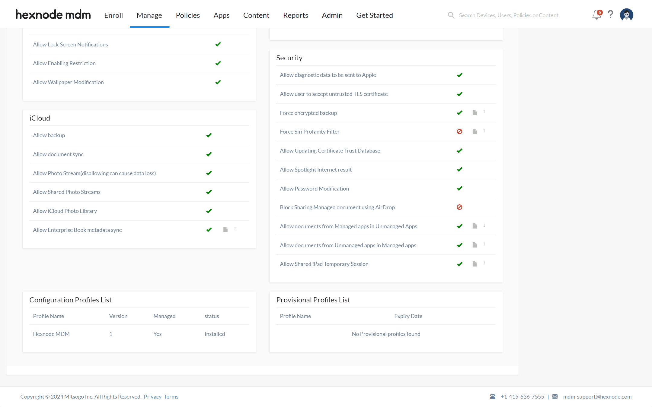
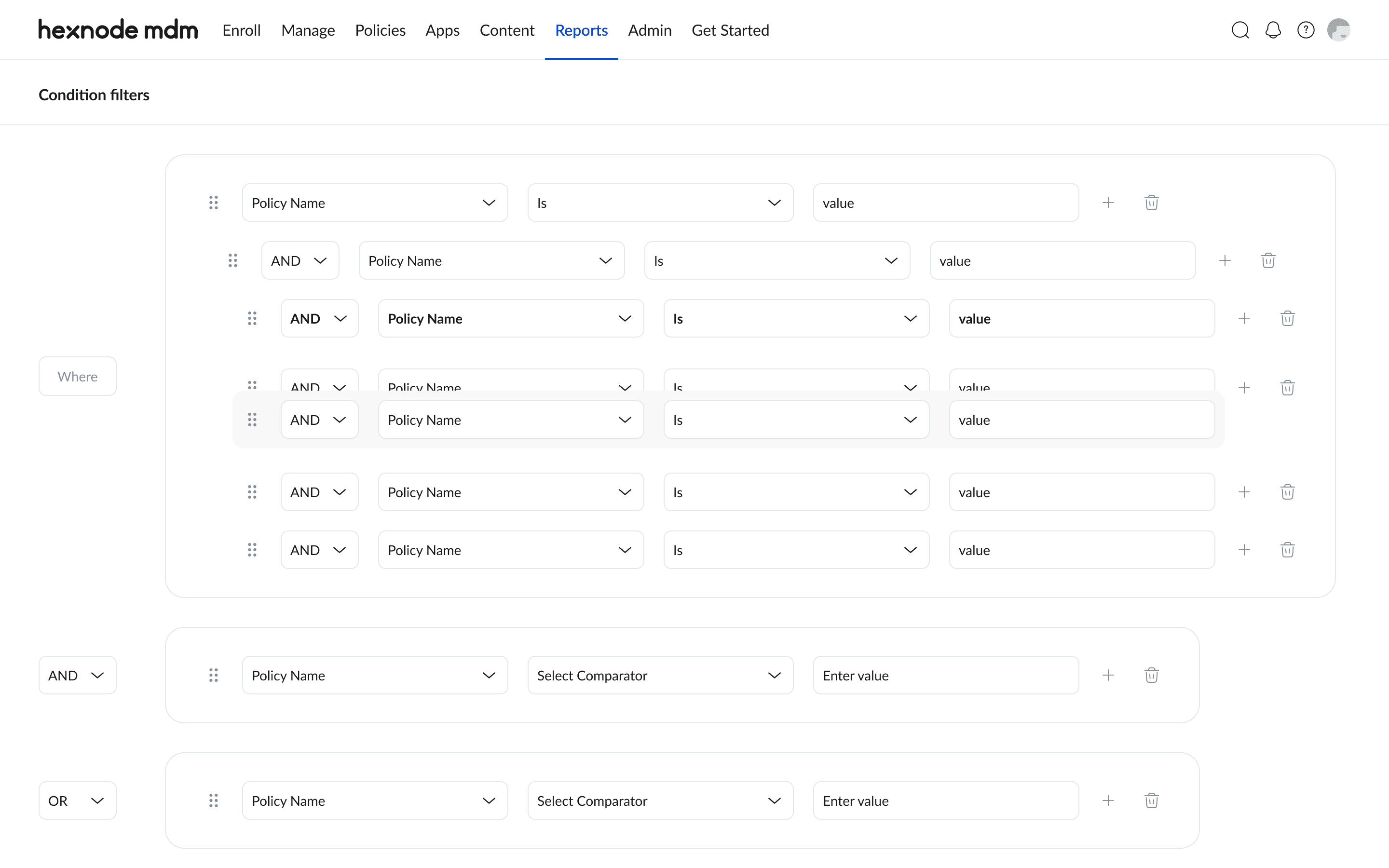
Reports

Reports

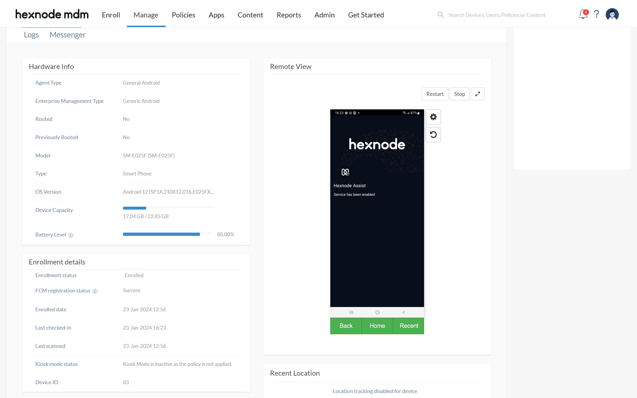
We enhanced this page so users can generate predefined or custom enrollment reports and easily view scheduled ones.

Impact: Reduced drop offs during sign in and onboarding. New users now complete the first setup 35% faster and report feeling more confident navigating the portal.

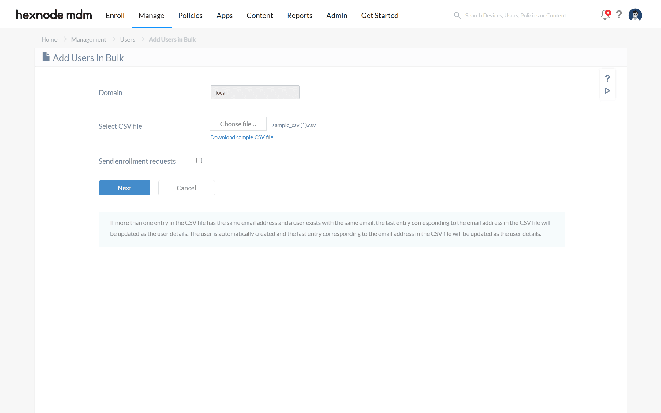
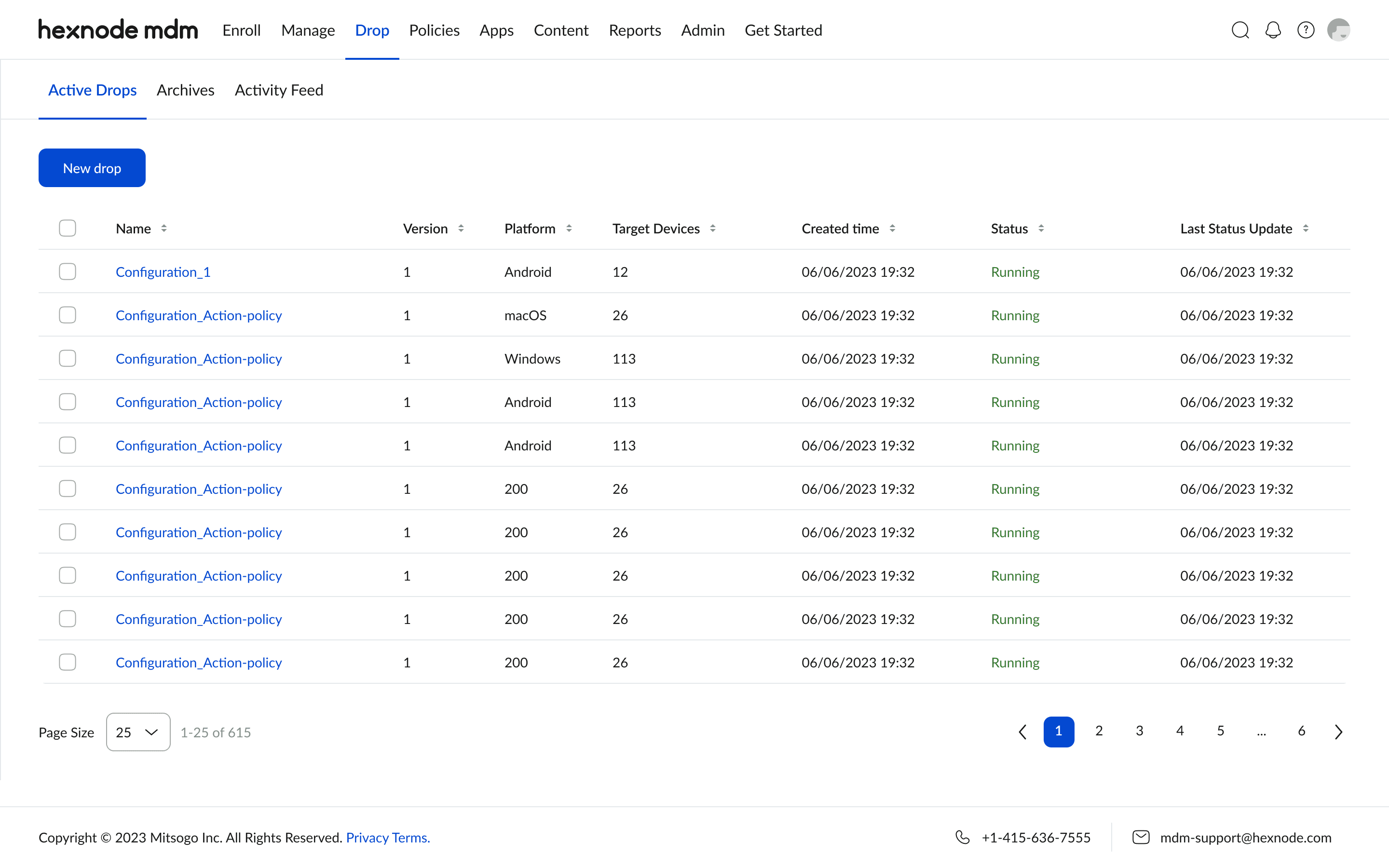
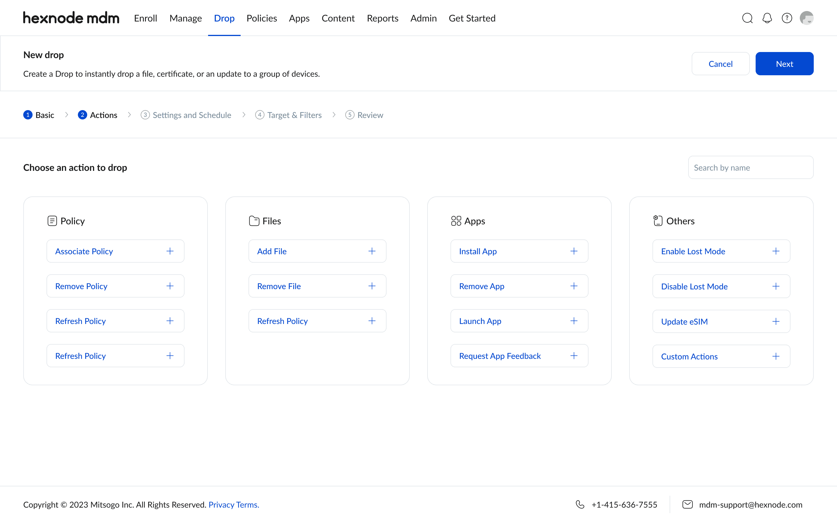
Deployment

Deployment

Bulk actions and clear step by step flows replaced the old clunky process.

Impact: Mass device deployment is now 2x faster, reducing operational downtime during large rollouts.
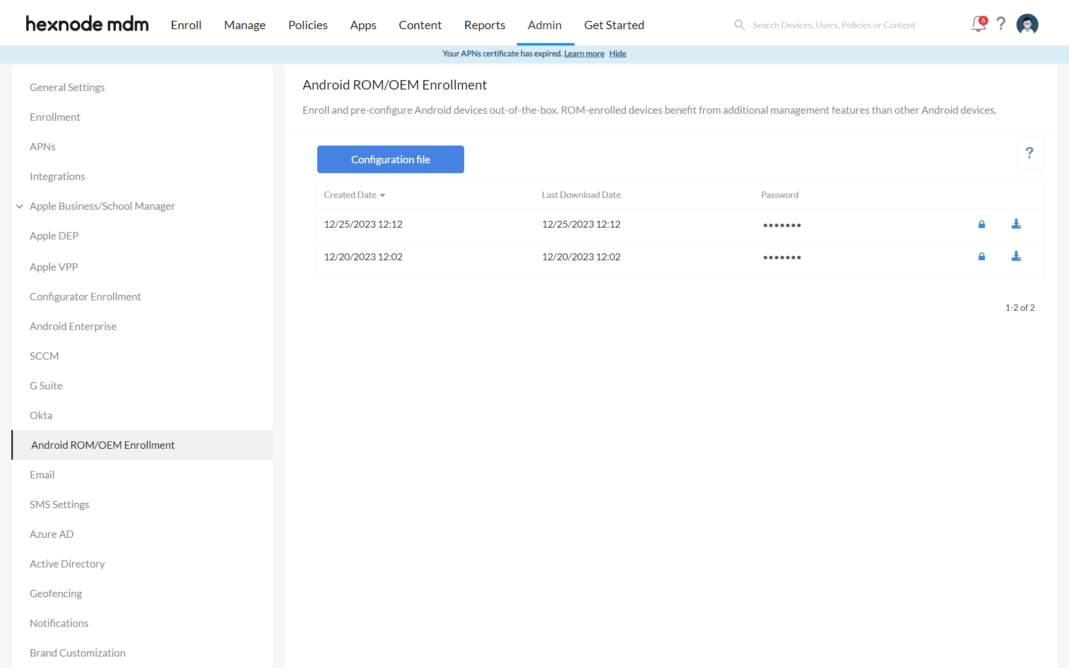
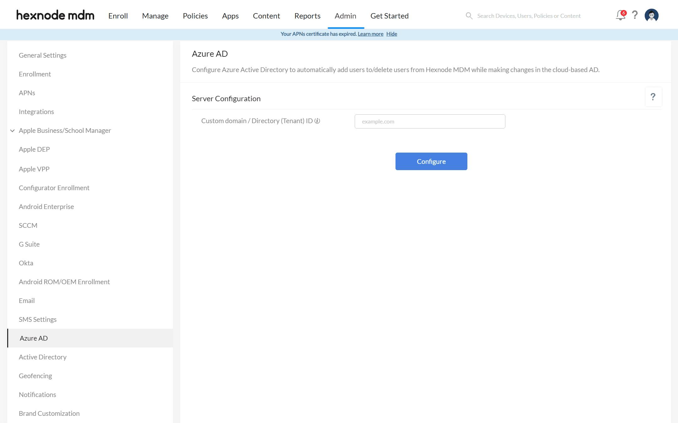
Admin Page

Admin Page

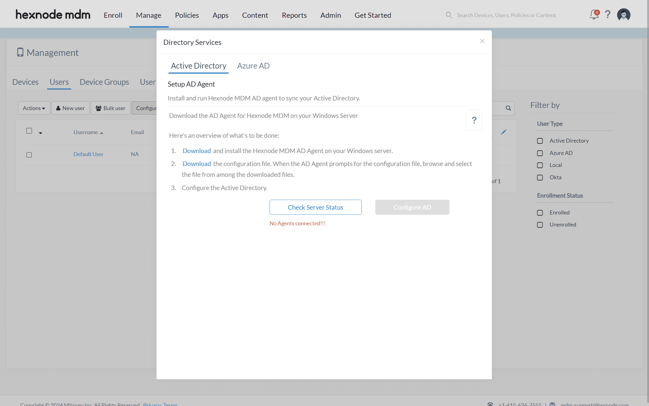
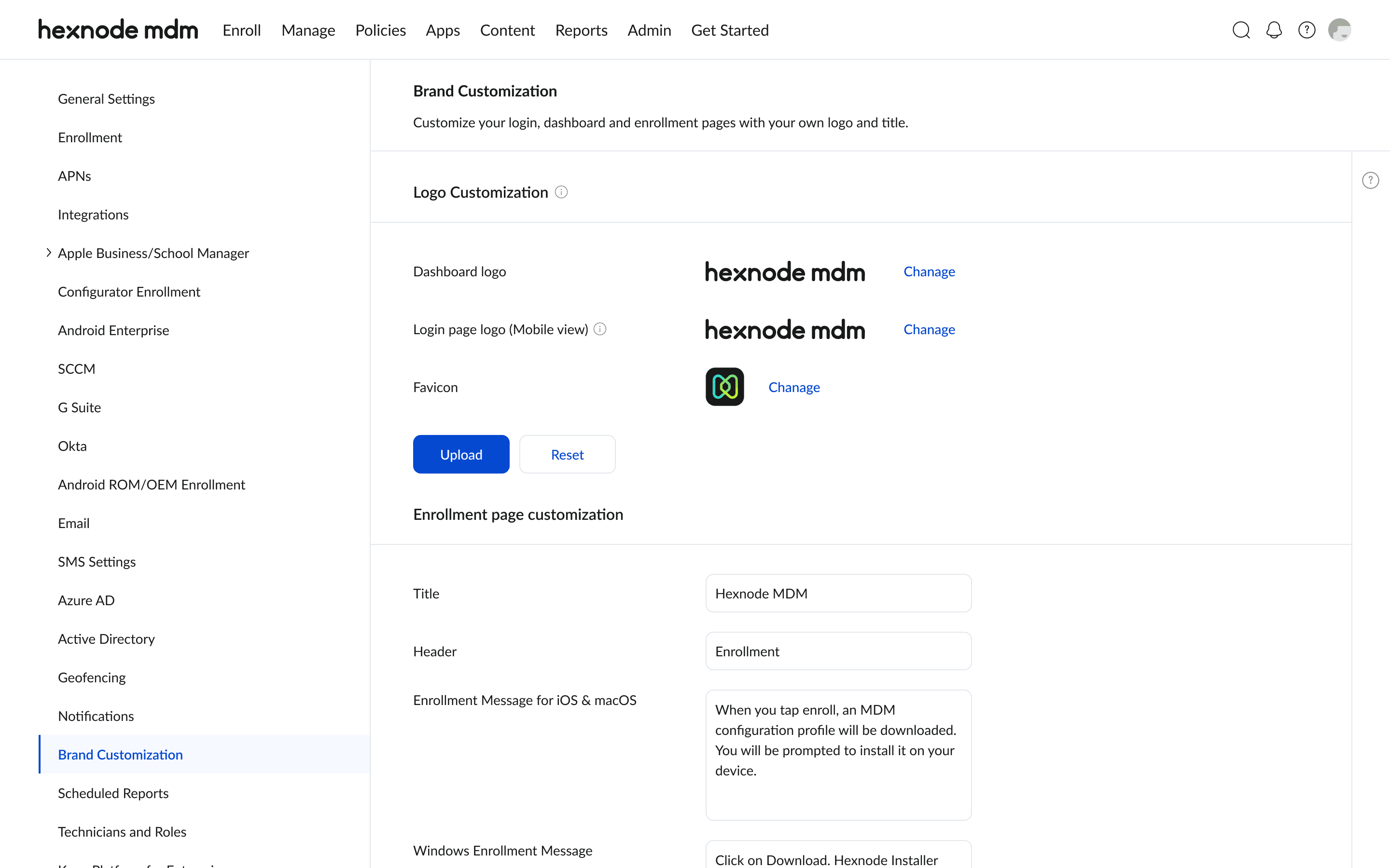
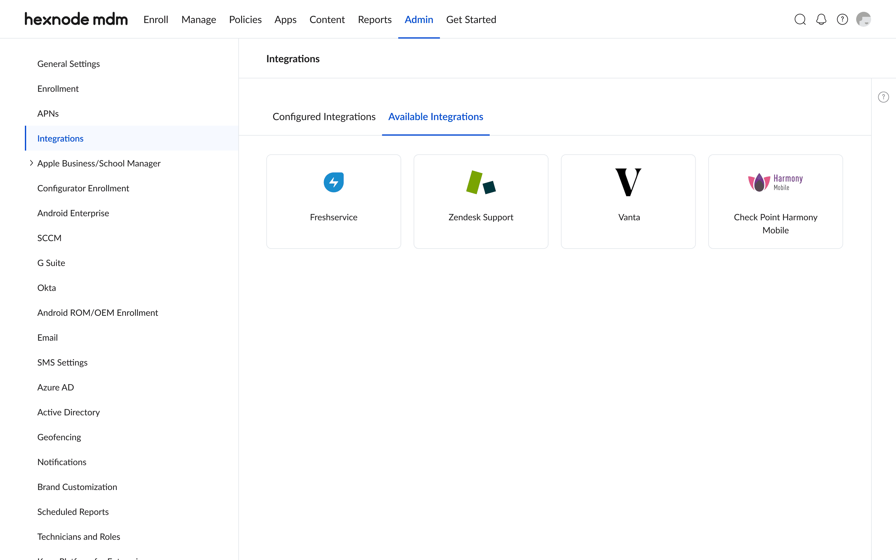
We reimagined the admin area to let organizations set up the platform around their own business needs. Now, admins can customize branding and choose the enrollment methods that work best for them.

Impact: Admins can now align the portal with their company identity while streamlining device enrollment, reducing setup time and supporting a smoother onboarding process at scale
Outcomes & Impact

Outcomes & Impact

Impact

Impact

Onboarding

Faster and more intuitive, with stronger awareness of key features.

Efficiency

Support queries are down thanks to simpler filters and workflows.

Deployment Speed

Bulk rollouts happen in half the time.

Scalability

The new design system makes adding future features far easier.

Reflection

Reflection

This project pushed me to think beyond designing screens and into designing systems. I had to find the balance between simplifying a complex enterprise tool and respecting the workflows that keep businesses running. In the end, it wasn’t just about making the portal look modern it was about making it work better for the people who rely on it every day.

Let’s Create Something Amazing

Design is better when it’s shared. I’m all ears for collaborations, side quests, or full-on creative missions.

Build with ♥️

Let’s Create Something Amazing

Design is better when it’s shared. I’m all ears for collaborations, side quests, or full-on creative missions.

Build with ♥️

Let’s Create Something Amazing

Design is better when it’s shared. I’m all ears for collaborations, side quests, or full-on creative missions.

Build with ♥️

Create a free website with Framer, the website builder loved by startups, designers and agencies.